
Embed the viewer
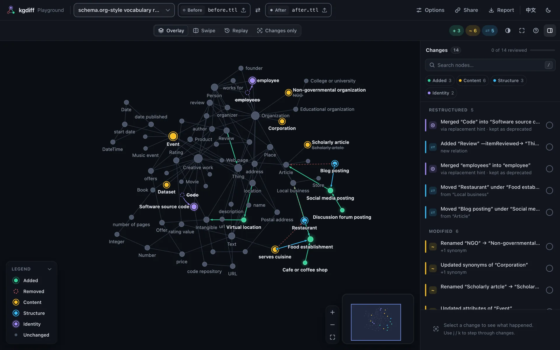
<kgdiff-viewer> is a web component: one custom element that works with any framework, or none. It is the same viewer as in the HTML reports and the playground.
Install
npm install @kgdiff/viewerThe package is ESM only and runs in evergreen browsers.
Show a diff
<kgdiff-viewer theme="auto" style="height: 640px"></kgdiff-viewer>

<script type="module">
  import '@kgdiff/viewer'; // defines <kgdiff-viewer>

  const viewer = document.querySelector('kgdiff-viewer');
  const text = async (url) => (await fetch(url)).text();
  await viewer.load({
    before: { text: await text('/graphs/v1.ttl'), filename: 'v1.ttl' },
    after: { text: await text('/graphs/v2.ttl'), filename: 'v2.ttl' },
  });
</script>
Give the element a height. load() takes each side as one of:
{ text, filename }: parsed withparseGraphof@kgdiff/compute, the format detected from the file name and the content;parsepasses parser options (ParseOptions);- a graph object
{ nodes, edges }in kgdiff JSON; - a normalized graph from
@kgdiff/core.
Optionally, diff passes diff options (matching, hierarchy predicates, ignored attributes), names the names of the two sides and title a title. The parsers, the diff engine and the layout are loaded on demand, so they stay out of your initial bundle.
Listen and control
viewer.addEventListener('kgdiff-ready', (event) => console.log(event.detail.stats));
viewer.addEventListener('kgdiff-select', (event) => console.log(event.detail.hunk));

viewer.next(); // select the next change
viewer.mode = 'replay';
viewer.play();
Every attribute, property, method and event, with its values and default, is in Viewer elements: reference, generated from the sources. The ones most pages set: mode (overlay, swipe, replay), scope (changes: only the changes, in any mode), theme, locale, panels (below) and chrome (none for small embeds). Events bubble out of the viewer and are typed on every element, the document and the window (KgdiffEventMap).
changes is a scope, not a mode. mode="changes", which meant "only the changes" before scopes existed, is an unknown value now: it reads as the default (overlay). Write mode="overlay" scope="changes" instead.
Arrange the layout
Every region of the viewer can be open, collapsed (folded to the control that opens it again) or hidden, with one attribute: the change list (list), the detail panel (detail), the search (search), the filters (filters), the view dock (dock), the replay transport (transport), the legend (legend), the zoom buttons (zoom), the minimap (minimap), the title (title) and the actions (actions). The viewer remembers what the reader changes (panels, the sidebar's width and the split between the list and the details, theme, palette, language) for the next visit; what your page sets wins over that. persist="none" turns it off, and persist-key="my-app:viewer" keeps your app's choices apart from other apps on the same origin. Panels has the rules.
The detail panel collapsed by default
<kgdiff-viewer panels="detail:collapsed" style="height: 640px"></kgdiff-viewer>The change list gets the sidebar's height; the reader opens the details from their bar. Set it as a property just as well: viewer.panels = { detail: 'collapsed' }. Reading panels gives back what your page declared; viewer.layout.panels has every region's state now, including what the reader changed. Setting the same panels again (a React or Vue re-render) keeps the reader's changes.
Watch the replay only
<kgdiff-viewer
  mode="replay"
  panels="list:hidden detail:hidden search:hidden filters:hidden"
  style="height: 480px"
></kgdiff-viewer>
The canvas takes the whole width, with the dock and the replay transport. Add dock:hidden zoom:hidden minimap:hidden for the transport alone, or use chrome="none" loop for an embed without any control (below). Composed from the elements, the same is a root and a stage alone: <kgdiff-root mode="replay"><kgdiff-stage panels="zoom:hidden minimap:hidden"></kgdiff-stage></kgdiff-root>.
React to layout changes
viewer.addEventListener('kgdiff-layout', (event) => {
  const { panels, sidebarWidth, source } = event.detail;
  if (source === 'user') saveLayout({ panels, sidebarWidth }); // e.g. per user, on your server
});
Your content over the canvas
The canvas has five slots for your page's content: top-start and top-end (under the title and the actions), bottom-start, bottom-center and bottom-end. The graph is framed clear of what you put there, at every fit and flight.
<kgdiff-viewer style="height: 640px">
  <my-status-card slot="top-end"></my-status-card>
</kgdiff-viewer>
A chrome element slotted there replaces the built-in region: <kgdiff-legend slot="bottom-start" variant="mini"> instead of the legend card, say, or <kgdiff-title slot="top-start"> and <kgdiff-actions slot="top-end"> instead of the title and the actions, which then sit where those did (below); panels keeps applying to every other region. In the compact layout of a narrow viewer the top-end content moves under the zoom buttons and the bottom content above the dock: keep it small there.
Embed a small looping replay
To show a graph's changes as a small strip on another page, leave the review UI out and let the replay loop:
<kgdiff-viewer mode="replay" chrome="none" loop style="height: 320px"></kgdiff-viewer>chrome="none" keeps the graph, its hover tooltip and a one-line legend; the header, change list, step caption, playback bar, zoom buttons and minimap go, clicks and shortcuts do nothing and the view stays fitted, labels included: no name is cut at the edge. loop replays the changes, pausing loop-delay ms (1.2 s) between rounds and while the mouse is over the graph. kgdiff-replay-end fires at the end of every round.
Compose your own layout
The viewer is made of elements you can also place yourself (stable since 0.10: they follow semantic versioning). <kgdiff-root> holds the diff session and shows nothing; the other elements show its parts wherever they are: inside it, or anywhere on the page with for="<root id>".
| Element | Shows |
|---|---|
<kgdiff-root> | nothing: it has the viewer's attributes, methods and events |
<kgdiff-stage> | the graph, with its own view dock, transport, legend, zoom buttons and minimap |
<kgdiff-change-list> | the list of changes, with review progress |
<kgdiff-change-detail> | the selected change |
<kgdiff-search> | node search, its results in a popup |
<kgdiff-filters> | the filter chips |
<kgdiff-view-dock> | the view dock: the mode, changes only and the context hops |
<kgdiff-transport> | the replay transport, in replay mode |
<kgdiff-legend> | the legend: a card (open reflects whether it is) or one line (variant="mini") |
<kgdiff-zoom> | zoom in, zoom out and fit, for one stage |
<kgdiff-minimap> | one stage's minimap (:state(overview) while the whole graph is in view) |
<kgdiff-title> | the brand and the names of the versions compared |
<kgdiff-actions> | the appearance menu (theme, colors, language) and the shortcuts dialog |
The change list in your own sidebar
<div class="app">
  <aside class="my-sidebar">
    <kgdiff-search for="diff"></kgdiff-search>
    <kgdiff-change-list for="diff"></kgdiff-change-list>
  </aside>
  <kgdiff-root id="diff">
    <kgdiff-stage>
      <my-legend-card slot="top-end"></my-legend-card>
    </kgdiff-stage>
  </kgdiff-root>
  <kgdiff-change-detail for="diff" class="my-drawer"></kgdiff-change-detail>
</div>

<script type="module">
  import '@kgdiff/viewer'; // or only what you use: '@kgdiff/viewer/elements/root', …/stage, …
  await document.getElementById('diff').load({ before, after });
</script>- Lay the elements out with your own CSS; give the stage and the list a height.
<kgdiff-root>renders asdisplay: contents, so its children take part in your layout. - The stage's slots (
top-start,top-end,bottom-start,bottom-center,bottom-end) place your content over the canvas, and the graph is framed clear of it. A chrome element slotted there (the view dock, transport, legend, zoom buttons or minimap) replaces the stage's own, and the stage'spanelskeeps applying to the rest. - Anywhere else, over the canvas or not, an element is not kept clear of fits and flights unless you register it:
stage.registerObstacle(element). - To draw on the canvas itself, under or over the graph (a background behind a group of nodes, your own marks on them), give the stage a layer:
stage.addLayer({ order: 'under', draw(ctx, view) { … } }). It is drawn with every frame, in CSS pixels (view.worldToScreenconverts the layout's positions), and is in the PNG export; the rules are in the renderer's README. Experimental, also after 1.0. <kgdiff-zoom>and<kgdiff-minimap>act on one stage: the nearest one around them, or the onestage="<id>"names anywhere on the page (zoom.stage, andzoom.stageElementfor the stage it found). Inside a<kgdiff-viewer>they act on its canvas. The other elements show the root's session, like the change list.- A minimap you place yourself stays shown while the whole graph is in view, so your layout does not move; hide it in place with
kgdiff-minimap:state(overview) { visibility: hidden }. Slotted into a stage, it hides then, as the stage's own does. - The keyboard map belongs to the root:
j/k,x,/and the rest work in every element bound to it,/focuses the search and?opens the shortcuts dialog of a<kgdiff-actions>, which lists the keys bound afterkeymap.shortcutsandkeymapgo on the root. The+,−andfkeys zoom and fit every stage of the root. - Composed elements remember nothing: your page owns the layout.
- Each element has a subpath that defines only it:
@kgdiff/viewer/elements/root,/stage,/change-list,/change-detail,/search,/filters,/view-dock,/transport,/legend,/zoom,/minimap,/title,/actions.
Before and after, side by side
<kgdiff-root id="diff">
  <div class="pair">
    <kgdiff-stage version="before" panels="dock:hidden transport:hidden"></kgdiff-stage>
    <kgdiff-stage version="after" panels="dock:hidden transport:hidden legend:hidden"></kgdiff-stage>
  </div>
  <kgdiff-change-list></kgdiff-change-list>
</kgdiff-root>

<style>
  .pair { display: grid; grid-template-columns: 1fr 1fr; gap: 12px; height: 480px; }
  kgdiff-change-list { display: block; height: 240px; }
</style>
One root, two stages: each draws one version whatever the mode (version="before", version="after", with a chip that names it) and has its own camera, zoom buttons and minimap. The selection, the hover, the filters and the search are the root's: pick a change in the list (or press j) and both stages bring it into view, each framing it in its own version; a node hovered in one is highlighted in both. Add <kgdiff-view-dock> for the changes-only scope, or <kgdiff-title> and <kgdiff-actions> above the pair.
A replay of a stage and a transport
<kgdiff-root mode="replay" loop>
  <kgdiff-stage panels="dock:hidden transport:hidden legend:hidden" style="height: 360px">
  </kgdiff-stage>
  <kgdiff-transport></kgdiff-transport>
</kgdiff-root>
The transport plays, steps and scrubs the root's replay from under the canvas instead of over it; it shows in replay mode only. Slotted into the stage instead, <kgdiff-transport slot="bottom-center"> replaces the stage's own and floats over the canvas, kept clear of the graph (keep dock:hidden).
Draw kinds of nodes as shapes
A report can say what shape each type of node takes, in view.shapes of its payload:
viewer.payload = {
  ...report,
  view: { ...report.view, shapes: { Concept: 'hexagon', Metric: 'diamond', Table: 'square' } },
};
The shapes are circle, square, diamond and hexagon. A node takes the shape of the first entry, in this order, among its types (the after version's; the before version's for a removed node), and without one it is a circle. Shape says what kind of thing a node is, color still says what changed: added, removed and modified nodes look as they always do, in their own outline. The layout does not change. The legend lists the shapes in use with their type names, as given (keep them short). A type name that looks like a whole number sorts first in a JavaScript object, so such a key does not keep its place. view.shapes is only read from a payload; load() has no option for it. Experimental, also after 1.0.
Theme it with CSS
Colors and fonts are CSS custom properties, set on <kgdiff-viewer> (or <kgdiff-root>) and inherited by the canvas and every panel. Override them with ordinary CSS:
kgdiff-viewer {
  --kgdiff-accent: #e8590c;
  --kgdiff-accent-soft: rgb(232 89 12 / 0.16);
  --kgdiff-font: "IBM Plex Sans", system-ui, sans-serif;
}
The token list is public API from 0.6. Light, dark and the color-blind palette stay available underneath (theme, palette); your values win over them, and keeping them readable is up to you. When tokens change in a way the viewer cannot see (a class on an ancestor, a stylesheet loaded later), call viewer.refreshTheme() so the canvas follows.
There are no ::part() names: 1.0 does not offer them, and theming goes through the --kgdiff-* variables above, which reach inside every element's shadow root. Adding ::part() names later would be purely additive.
Keep review progress
The viewer remembers in the browser which changes were marked reviewed. To keep that progress somewhere else, such as your backend, listen to kgdiff-review and restore it with setReviewed():
viewer.addEventListener('kgdiff-review', (event) => save(event.detail.progress.reviewed));
viewer.addEventListener('kgdiff-ready', async () => {
  for (const id of await loadSaved()) viewer.setReviewed(id, true);
});
The ids are hunk ids, and they belong to one pair of versions. Save them under that pair, or read Hunk ids before carrying them over to a newer version: the same id is the same place in the graph, not the same content.
Editor support
@kgdiff/viewer ships a Custom Elements Manifest (custom-elements.json, named by the package's customElements field) that tools read, and two files generated from it, like the reference:
VS Code completes and describes the elements and their attributes in HTML with the package's custom data. In your project's
.vscode/settings.json:json{ "html.customData": ["./node_modules/@kgdiff/viewer/vscode.html-custom-data.json"] }React 19 with TypeScript types the elements in JSX, their properties and their events (stable, like the elements): import the types once, anywhere in the project.
tsimport type {} from '@kgdiff/viewer/react';
React
React 19 renders custom elements with their properties: a prop the element has as a property (panels, keymap, mode, …) is set as that property, objects included, and any other as an attribute. Import @kgdiff/viewer before rendering, so the elements are defined by the time React sets their props. With TypeScript, @kgdiff/viewer/react types them (Editor support).
import '@kgdiff/viewer';
import type { GraphSource, KgdiffViewerElement } from '@kgdiff/viewer';
import type {} from '@kgdiff/viewer/react';
import { useEffect, useRef } from 'react';

interface Props {
  readonly before: GraphSource;
  readonly after: GraphSource;
  readonly onSelect: (hunk: string | null) => void;
}

export function GraphDiff({ before, after, onSelect }: Props) {
  const viewer = useRef<KgdiffViewerElement>(null);

  useEffect(() => {
    void viewer.current?.load({ before, after });
  }, [before, after]);

  return (
    <kgdiff-viewer
      ref={viewer}
      theme="auto"
      panels={{ detail: 'collapsed' }}
      keymap={{ x: null, r: 'review' }}
      onkgdiff-select={(event) => onSelect(event.detail.hunk)}
      style={{ height: 640 }}
    />
  );
}onkgdiff-selectlistens tokgdiff-select: React 19 adds a listener for anon…prop the element has no property for. Itsevent.detailis typed.- Methods go through the ref:
viewer.current?.next(). - The
panelsobject literal is a new object on every render, and that is fine: the viewer compares what the page declares, so a re-render declaring the same panels keeps what the reader opened or closed; only a region whose declaration changed gives way. - React 18 sets every prop as an attribute: use the text forms (
panels="detail:collapsed",keymap="x:none r:review") andaddEventListeneron the ref for events.
Vue
Tell Vue that kgdiff-* tags are custom elements, in vite.config.js:
import vue from '@vitejs/plugin-vue';

export default {
  plugins: [
    vue({ template: { compilerOptions: { isCustomElement: (tag) => tag.startsWith('kgdiff-') } } }),
  ],
};
then use them like any element:
<script setup lang="ts">
import '@kgdiff/viewer';
import type { GraphSource, KgdiffViewerElement, ViewerPanels } from '@kgdiff/viewer';
import { onMounted, ref } from 'vue';

const props = defineProps<{ before: GraphSource; after: GraphSource }>();
const emit = defineEmits<{ select: [hunk: string | null] }>();
const viewer = ref<KgdiffViewerElement | null>(null);
const panels: ViewerPanels = { detail: 'collapsed' };

onMounted(() => viewer.value?.load({ before: props.before, after: props.after }));
const onSelect = (event: CustomEvent<{ hunk: string | null }>) => emit('select', event.detail.hunk);
</script>

<template>
  <kgdiff-viewer
    ref="viewer"
    theme="auto"
    :panels.prop="panels"
    :keymap.prop="{ x: null, r: 'review' }"
    style="height: 640px"
    @kgdiff-select="onSelect"
  />
</template>.propbindspanelsandkeymapas properties, objects; Vue binds to the property anyway when the element has it, and.propmakes sure even before the element is defined.@kgdiff-selectlistens to the event. Vue does not know the element's events, so the handler typeseventitself.- The template ref gives the element, for its methods.
Svelte
Svelte 5 sets an attribute of a custom element as its property when the element has one, objects included, and as an attribute otherwise; onkgdiff-select listens to the event, and bind:this gives the element.
<script lang="ts">
import '@kgdiff/viewer';
import type { GraphSource, KgdiffViewerElement, ViewerPanels } from '@kgdiff/viewer';

interface Props {
  before: GraphSource;
  after: GraphSource;
  onselect: (hunk: string | null) => void;
}

let { before, after, onselect }: Props = $props();
let viewer = $state<KgdiffViewerElement>();
const panels: ViewerPanels = { detail: 'collapsed' };

$effect(() => {
  void viewer?.load({ before, after });
});
</script>

<kgdiff-viewer
  bind:this={viewer}
  theme="auto"
  {panels}
  keymap={{ x: null, r: 'review' }}
  style="height: 640px"
  onkgdiff-select={(event: CustomEvent<{ hunk: string | null }>) => onselect(event.detail.hunk)}
></kgdiff-viewer>
Without a bundler
@kgdiff/viewer/standalone (dist/standalone/kgdiff-viewer.js) is a classic script that defines the element and shows precomputed diffs: it is what the HTML reports of the CLI embed. With its compute add-on, @kgdiff/viewer/standalone/compute (kgdiff-viewer-compute.js), it can also load() graph objects ({ nodes, edges }) and show payloads without a layout, which it lays out when it reads them (without the add-on, such a payload shows an error that says so). Parsing text in the browser needs the ESM package and a bundler.
Large graphs
For large graphs the viewer opens with Changes only on, which lays out the changes and their neighbourhood instead of the whole graph. Computing a big diff and its layout takes time in the browser; the CLI's HTML report does that work ahead of time and opens instantly.